Today on 02/10/15, I drafted numerous designs in lesson to learn about proportions and facial features for a humanoid character, and I also started to plan my basic character out of a variety of options with a draft style to hone my skills and understand what my character will look like, making the process easier to transfer it to pixel art. It also has helped me practise the techniques needed for my character. For example; the concept behind my main character it’s a bird, but every body part of it like the feet, eyes, wings, etc are designed to be made out of the shape of teardrops, due to it’s simple, charming shape and overall nice design. Some examples of the work I achieved today will be listed below, showing a brief-proof of concept which I will expand upon later:

I also created a mind-map
for the main character, showing the thought process which went into making the
character and some design ideas.

Today on 09/10/15 I worked towards the proposal document for my game and completed the entire thing. It’s a large 7-page written piece of work explaining my game idea that was generated with the random dice roll, explaining all the fundamentals such as the gameplay, characters and level themes. I can use this moving forward with my artwork since I now have a clear basis for what I’ll be drawing, and what all of the characters, objects and environments will be based off in the pixelated art-style. I continued to Harvard reference everything I did and next week I will work towards improving my skills in Photoshop.
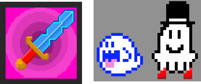
Today on 16/10/15 we learned a variety of skills in Photoshop, such as cleaning up scanned images and colouring them, filling in a character with plain colours and pixel art. This was a very insightful session as I learned a tonne of skills I can move forward and use in my project, especially the pixel art. We made a sword together in class that I added some creatively influence to and I then independently designed and created a couple of pixel ghosts to hone my skills. (This was because ghosts are very simple entities, and most are depicted as being a simple shape colour. Another one was based off the Boo from the Mario Bros games and the other was an original creation of a ghost wearing a top-hat and wellies (all these are shown below). I have already conducted research into pixel art (as shown above), so I can understand the lateral thinking needed to produce the content and the sacrifices (such detail) that must be made. However the style can give you a very charming and iconic look, and combined will various other skills I’ve learned today (like anti-aliasing on the magic wand and paint-bucket tool, as well as the tolerance level to add gradients to existing fill lines), I’m one step closer to creating my own characters in a pixelated format.
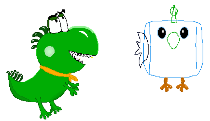
Today on 23/10/15 we furthered our skills in Photoshop by firstly using graphics characters to digitally draw a draft of our game characters, and also utilise a variety of skills to create our own metal textures from scratch. First, I decide to expand the character concepts I made earlier on where you play as a bird, but because it was created digitally I redid and redesigned many areas multiple times like the beak and wings to get them just right, since once you’ve made a mistake when physically drawing it’s much more difficult and time consuming to remedy it, rather than pressing undo on a PC. And in this process of trial and error the bird ended up standing more upright than all of my previous drawings with, its wings spread out in a more three dimensional posture.
In my opinion though the character design still needs some work, especially since it’s going to be adapted into a pixel-based artstyle. As the bird still looks fairly off for what I’m going for, and not as small/cute as what I was expecting with its slender body and large wingspan, so it still needs some work. The bird’s draft image is shown below, bear in mind I didn’t finish the shading on the bird’s body, and the style uses a mostly flat colour for each body part as it will lend itself well to pixel art (however you can briefly see a shaded red section I did under his tummy using different shades of red and the blur tool, to show what it would look like for the full-finished render). But as it stands the bird image paints good enough a picture of the character, and there are various things I want to change in the future anyway as I’ll go back closer to the original design (as right now the bird stands up too far straight, and the feathers on the wings should be more triangle shaped than random ‘hills’).
For the metal texture we could add our own creative spin to it, so to mix things up while also similarly matching the style of my own game, I made my texture very stylised and colourful. I gave the metal a more plain, blueish hue, made the rust look very bright and spotted and even made the bars/ bolts have a very outlined and vibrant appearance. The texture as a whole is shown below, with other more laid back appearances like having a Bugs Bunny stamp being imprinted into the materiel as graffiti. This all has helped enforce a very unique and also creative artstyle, showing simplicity in some case can work just as well as textures with far too much detail. The texture was also designed to a very professional standard following industry-level practices, using a variety of tools in the industry-level Photoshop (like gradients and multiplying layers to blend colours).
Today on 06/11/2015 I started learning Adobe Illustrator for the first time, learning a variety of skills in the processing using professional-level software and creating two A4 pages of artwork. I used a variety of the tools available to create so the artwork this lesson (shown below), such as: the Pen Tool with adding/changing/removing Anchor Points in order to draw and fill basic lines, the curvature tool to draw circles, ovals and curves (like fingers) and other more advanced features like the Pathfinder Window to merge shapes together and use the Intersect Tool for shapes (to merge together my lines/ circles and merge them into my letters to create a pattern).
I also created a big variety of original content using this tool to show-off the various possibilities you can create. These range from: a basic face, stars, a wizard, a cactus in fancy dress, a cute ghost, a Boo from the Mario games and finally my very own logo spelling the phrase ‘2d Art’. These really show the possibilities of Illustrator, even with my limited skillset as there are a variety of things you can make (and, as shown by my logo I made, you can make some very high-quality stuff too).


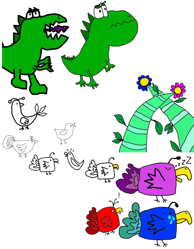
Today on 13/11/15 I did various concept artwork for my enemy character, a beanstalk object and my bird character. First I drafted various positions of the dinosaur on paper to show how it would work in the game, such as flying and climbing up a beanstalk. Afterwards I took to Photoshop and made an extremely brief first draft to see how it would look, making some altered affects like making the head more streamlined and connected to the body in order to make the conversion of the character to pixel art easier. The dinosaurs looks pretty angry and grumpy, but cartoony enough to not be considered scary and still quite ‘cute’. Likewise the beanstalk is my first object I’ve drawn in a few poses with varying leaf patterns, with its simple shape and iconic appearance, making it very suitable for pixel art later on that the player and enemies will be able to platform over in the game!
I also moved onto a more finalised design for my main bird character, being a smaller and more rounded shape than before to match the cutesy them. First I drafted a couple of designs in Photoshop with various shapes and sizes, and then chose to use a mix of all the various concepts I had for my final design, but put them into one base-bird. In the end though I chose the square-shaped design to take forward, and created yet another document with various colours and alterations, with a new concept where the colours match the bird’s emotions (so in my examples below he’s white when normal, blue when sad, purple while sleeping, and red when shocked!). . Afterwards I then moved onto creating a pixel art version for my game, but it barely started and never finished, so thus is not shown here. I’ll continue to perfect it next week though, since it’s my finalised design that needs to be taken time on. Here is all of the concept art I produced within the last week below:

As of 18/11/2015 I had created a finished version of my character (who now has a name: Pippy), in a pixel-art format, and also created sprite sheet exhibiting his walking and idle animations. The bird’s final design has changed a lot since its original concept, shifting from being designed around a teardrop, to then being realistically proportioned, and finally going back to basics with a cute and simple character with a boxed-shape and an antenna on its head like an anglerfish (as shown in the concept of a few birds in my previous blog post). The bird’s colour has transitioned from red, to white and then to blue as well as I feel it’s a much more neutral and pleasant colour, and easy on the eyes while playing a game as that character. All of my pixel art will be at a 256 x 256 resolution, as it matches the simplistic, but not too undetailed, look I’m going for very well.
For the sprite sheet I the idle and walking animations are short and snappy to match the style of older, retro games, but I will also have other applications for them. For example on the course I am also programming a platformer game in Unity, so I decided to create the spritesheet to also match my needs there and create my own character and put it into the game. Another reason I did those two animations is because of how important they are, almost every character will be both moving and standing still in a game so it’s compulsory to create something to match that in my work.


I also took the bird further with the emotion concept in the sprite sheet, as mentioned in the last blog post and shown above. These emotions are, in their respective order: Happiness, Sleepy, Sadness, Envy/Jealousy, Shocked/Surprised, Thoughtful and Angry. They will be incorporated into the full game throughout the gameplay and story, as the bird reacts to various situations as the dinosaurs take over his homeland in the sky, and the colours become an iconic representation to the character. So if he’s attacked by a baddie, he’ll be shocked, thoughtful when left idle in front of a tricky puzzle and happy when he reaches the end of a level. It is also a concept designed to help younger players have a visual representation of emotions in the form of colours, as a way to tell different the bird’s feelings and states of mind apart at a quick glance.
Today on 23/11/2015 I finished the pixel art for my Beanstalk and started work on the dinosaur. The beanstalk went through a few changes from the earlier version, such as swapping the colour schemes alongside the different flowers to add some more variety to the world and also some shadow effects/ added detail on the leaves and petals. The shadows in particular helps add another layer to the beanstalk, and also creates a pseudo-3d effect giving the beanstalk’s trunk a curved edge. The beanstalks that I researched before were incredibly useful for creating this final product, as I could gage a good sense of shape from them and include the critical features (such as the leaves and flowers), may look like in a cartoony fashion.
All of this digital artwork has been created in Photoshop so far, due to it being software for good professional working practices as many areas of the industry use it. For the pixel-art specifically, it has a variety of tools and tricks available to help make creating pixel-art more streamlined, including the magic wand tool, lasso tool and hue/saturation slider.

Today on 20/11/2015 I created the finalised version of my dinosaur and began work on the front-view of my bird, it’s still in draft stages though as I plan the correct proportions for the character. The dinosaur has also undergone a few changes since the previous draft; such as having a smaller, but more realistic mouth with teeth ( rather than having some green triangles in the jaw be teeth instead), wearing an orange ascot scarf to keep up with the game’s cutesy trend, making the dino’s spikes more curved to have a distinctive feel, and I have lastly given the dinosaur some cutesy cheeks on its head to cover up the large area of green space, which also giving it a more iconic appearance. The enemy of the game being a dinosaur matches the chance-based project theme we were assigned at the start of the brief, which means it’s very-much relevant and a core part of the potential game.
The dinosaur matches the general artstyle I’ve been going for with my pixel-artwork in general, being fairly simplistic and easy on the eye to look at, using bright colours and simplistic features in order to not overcomplicate the character designs. However it’s still iconic and relatively ‘scary’ enough to be instantly recognised as an enemy in the game the first time a player sees it.
Meanwhile, for what I’ve completed so far, the bird’s height in the front-view drawing matches the same height as the finalised one, in order to keep the bird’s proportions in check (such as the eyes and beak also being exactly the same size), and this is a good example of following professional working practises due to keeping everything to scale and reshaping/sizing parts that aren’t right accordingly. However the bird is slightly thinner compared to the sideways artwork, in order to show it’s not a completely square and has a more rectangular design.
Today on 02/12/2015 I completed the proportionally correct front and back view of my main bird character. The back view was easier and faster to create once the front was completed, as many of its body features can stay with minor changes, since the back tail feathers covering most of the body hide them, such as having the wings peep out from behind the tail, remaking the feet to be from behind and having the antennae on the head be mostly covered by the stem.

The island on the other hand has a pseudo-2d feel (similar to Rod Hunt’s work), including dynamic shadows pointing away from the sun, a stylised waterfall sing gradients/ cell shading and even a tree with an owl hole attached. The island is supposed to look relatively desolate and empty, as it floats about in the vast sky alone, but at the same time I wanted it to have a small variety of staple features you’d see on a regular island.


Today on 02/12/2015 I completed the proportionally correct front and back view of my main bird character. The back view was easier and faster to create once the front was completed, as many of its body features can stay with minor changes, since the back tail feathers covering most of the body hide them, such as having the wings peep out from behind the tail, remaking the feet to be from behind and having the antennae on the head be mostly covered by the stem.
The bird’s front was finished off from last week too, matching the back view with correct shading from a light source directly above the creature. The creature overall now it’s finished was much easier to translate into a 3d space than I originally thought, as the simple design means that there aren’t too many complicated angles to work with when making the various body parts. However parts like the beak took a bit of planning in order to judge how the light would reflect down it and still match the 2d drawing, but in the end I’m incredibly proud of the character I’ve created, and it looks to a professional standard and was created using various professional tools and techniques that I’ve listed throughout my time creating art in this blog.
I also practised spray mounting today as another art technique, where I printed out the side view of my bird and sprayed it with glue in a booth over a foam sheet. After then cutting it out with a scalpel and metal ruler, I then had a finished professional-level product that was ready to be mounted on a wall for an exhibition.
Today on 04/10/15 I created drafts of both my floating island and airship pieces of art on paper, with various designs of each, and then went on to create a more polished digital version of one that I wanted to take further. Afterwards I chose to merge the draft island and airship ideas together (but stuck with the winged airship design for the most part as it had the most intricate yet simple design I feel is well suited to my game’s artstyle), and innovated with the idea to give a flying ship wings in order to match with the birds in the game’s sky theme. I even took this further and made the wheel used to steer the ship look like the bird’s antennae, and made the airship spear and windows look like eyes!
Later on I completely discarded the idea of the airships having fiery rockets and jetpacks attached (as shown in the top-right airship draft), as it was a bit weird to have enemy dinosaurs use fossil fuels (essentially their dead relatives) to power their vehicles. The airship (now finished in Photoshop ready to be made into pixel-art) has changed a lot since the draft, and resembles an actual bird in appearance and is modelled to look like on, in order to keep an ongoing theme and trend with birds on the sky for the project.


Today on 06/12/2015 I finished my airship and island drawings, ready to be organised onto 5 posters and then handed in for my project. For the final airship I slightly adjusted the fences on the top to be in line with the propellers, and changed the front wheel-guard to be more streamlined. The ship’s shape and features were also slightly tweaked even more from the draft to become more ‘bird-like’. And in order to create a larger sense of scale for these drawings, since all of my final images are created in the same 256 by 256 resolution, the outlines for objects in both my island and airship are thicker (usually by 2 or 3 pixels wide instead of 1 used on the main character bird), as it helps show that these are much more grand in size and as such have a sturdier build to them. To carry on from this I also improved the airship in other, more industry-level, ways. Such as putting small wobbly black lines near the propellers on the airship, to give the illusion of motion even in a static image.
As a nice touch I also added a vinyl sticker onto the airship reading 'Dino Labs’, as it’s the main mode of transportation the enemy dinosaurs will be using in the real game, so it feels natural to give it a stylised and iconic logo. It even has a peeling effect I made on the dinosaur’s head, where it looks like how a regular sticker would roll-up and peel off a surface after it’s been stuck to it for a while. As another touch since both of these creations are floating in the sky I created a gradient blue background with clouds to add another layer of detail to the world.
On the island I stuck to the original design quite a lot, but added various other things like rocks in the pond, a tree stump with a decorative swirl and even wild a rabbit to give the land a sense of life and being. The final draft leaves some of the other elements behind (like the tombstone on one island), as I feel it would oppose the artstyle I’ve tried to create. I also added more detail to the pixelated shadows which are dynamically drawn in relation to the sun in the picture, this helps use the plain flat grass as a canvas to project my different shadowing techniques I’ve learned and improved upon over this development period, and also means that the lacking of intricate detail on the surface of the grass isn’t a very important omission. Speaking of detail I even added some white frothy bubbles in the waterfall, as it helps match the grey-to-blue gradient which is already present.


Final evaluation:
Overall now that my artwork is all finished I’m very proud of what I’ve managed to achieve, and I feel that pixel art was a suitable route for me to take. Since precise time and care can be taken with pixel art, and it’s much more mathematical with the placing and colouring of each individual pixel, I feel it suited me much better than traditional or digital drawing techniques (like using a graphics tablet). I feel my content, especially the main character Bird with all three viewing angles and the sprite sheet, are very well made and incredibly detailed, while also having a minimalistic and colourful artstyle. The design of the Bird’s antennae and beak in particular I really love, as the colours blend together seamlessly while also giving the character a very recognisable and cute appearance, a style I was going for from the start. Also the few ideas I had at the start that went largely unused (like the Bird and every body part of it being shaped like a teardrop), instead still saw the light of day and l got recycled somewhat, as the bird's crying emotion still features a lot of blue tears, matching the original design where it was always crying.
My character may be good, however I believe a few other things could still be improved upon, for example my Dinosaur and Airship I feel are lacking somewhat in design, with the Dinosaur being shaped in a way that looks like it may struggle to stand up in real-life. The Dinosaur in particular has body parts like the arms and eyes in a 3d perspective, but then the head shaped sideways into a 2d perspective, something that can appear a little puzzling at first glance. This is the same for the Airship, however is an opposite case where most of the features are in a 2d perspective, but a few objects like the door and ladder are viewed in a 3d manner. However for the most part these assets in my opinion wouldn’t feel out of place in a typical 2d platformer game, and fit the style of other famous pixel artists like Rod Hunt wonderfully and my research into his work was incredibly helpful for me to find a good style that compliments working with a pixelated style at very low image resolutions, as he packs a lot of different content into one picture, with a tonne of things going on at once like cars, people and animals. Even all the various other example images I found online of games, birds, beanstalks, airships and islands were a useful comparison for my own work, and set the standard for what I was aiming to achieve.
As mentioned in previous blog posts, the artwork I developed used a lot of different professional tools and practises for their creation. From using high-quality pieces of digital software like Adobe Photoshop and Illustrator to make my work, to applying a mass of professional techniques, such as: Adjusting the opacity of shadows in different layers, applying gradients to shapes, calculating the exact number of pixels in lines and shapes for the pixel art I’m making so it can be symmetrical, and generally using a multitude of tools in Photoshop like the Magic Wand, Brush and Pencil, Magnifier Glass, Animation Timeline, Hue and Saturation effects, Fill Bucket, etc. I followed very good industry practice from start to finish that is commonly used throughout games development, and was great experience to apply in other projects.
To conclude from all of this, I got a lot done during this assignment and produced a variety of high-quality content that will be great examples for me to show off my skillset and what I’m capable of when moving forward!


